
CAKE PULSE
AN INTERNAL TOOL DESIGNED TO HELP CAKE’S SUPPORT TEAM LEARN TO QUICKLY DIAGNOSE PROBLEMS

The challenge
A point of sale system is a complex piece of technology, the beating heart of a restaurant, through which every order, payment, report, and refund is run. Because no two restaurants operate in the exact same way, the point of sale system is also incredibly complex to configure. Luckily, at CAKE we have a great support team, ready to help with all of that.
The main application our support team uses to help diagnose and troubleshoot customer issues is an internal tool called Pulse. It was created years ago by developers and for developers. When new pieces of information were needed, they were simply added on… below.
Though Pulse truly has everything needed to be able to diagnose a restaurant operator’s tech problems, it is also very difficult to use, and as the team grew and more roles relied on this technology, we found that the tool no longer met the needs of all of its users.
The Plan
There are five different groups of people that use Pulse on a daily basis:
Tier 1 Support, who answer phone calls and provide the preliminary frontline help to restaurant operators
Tier 2 Support, who take on more difficult cases that require more time, investigation, and specialized knowledge
App Support, who are the engineers that make any necessary technical changes and do not speak with customers
Customer Success, who reach out proactively to our VIP customers, providing them with extra services and support
Training Team, who work with customers at the start of their relationship with CAKE, helping to set their menu and learn the system
Each of these groups has different needs. In order to preserve all of the functionality each group needs, and try to organize the information in a more helpful way, I needed to fully understand their goals.
Tracking Current Usage
I started by spending a lot of time observing them in their daily work, listening in on calls and watching as they interacted with other teams. From this I documented work flows and made an inventory of how frequently each group used each page, and various individual components of the app.

Frequency of use of various pages of Pulse by all 5 roles

Frequency of use of some of the main components.
User Research
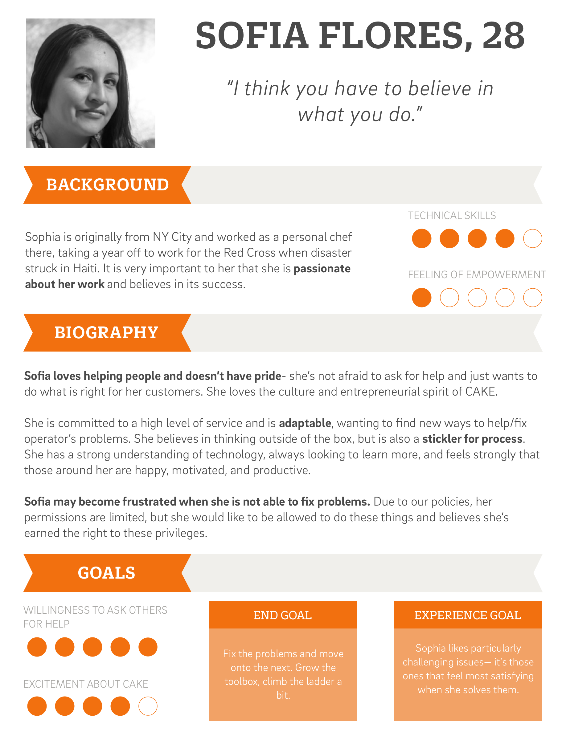
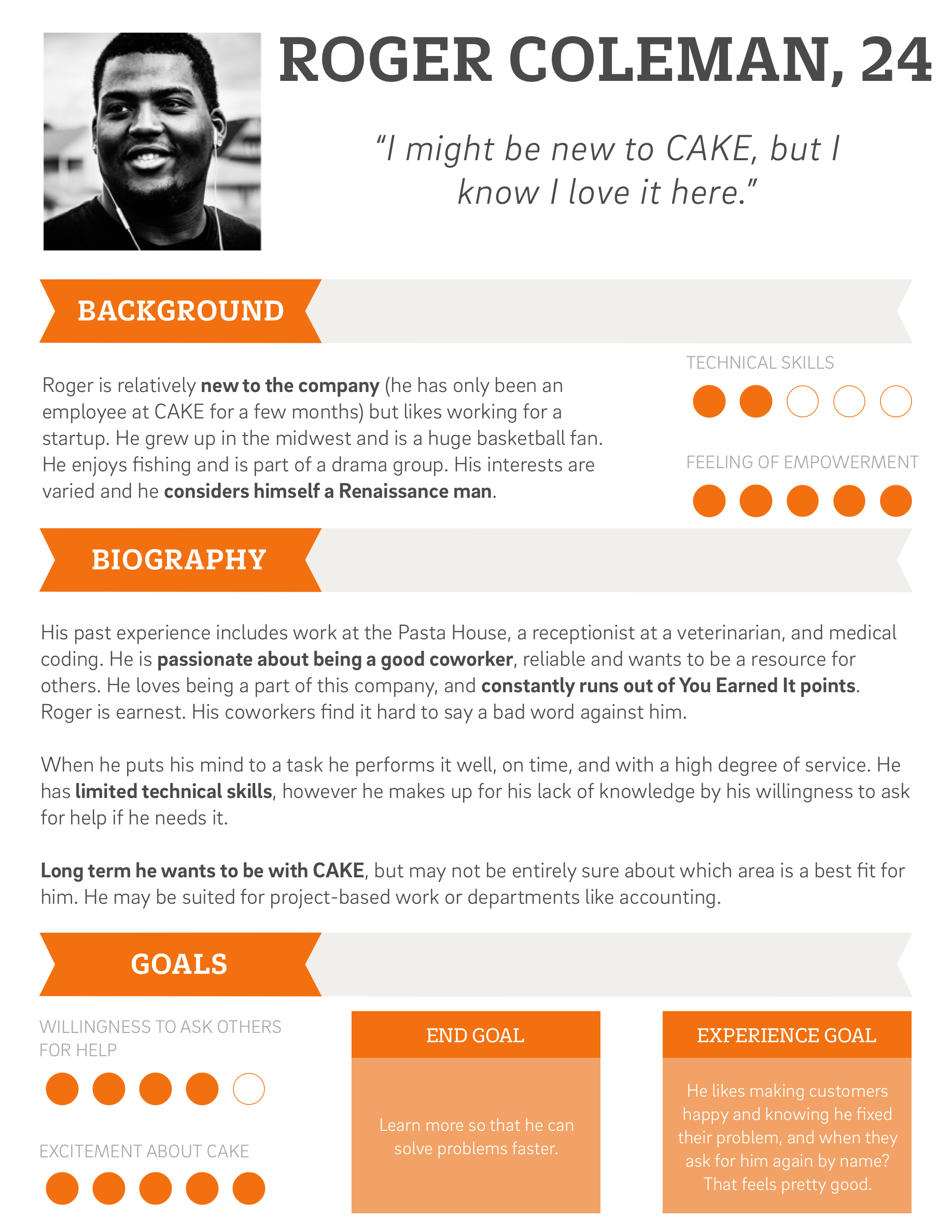
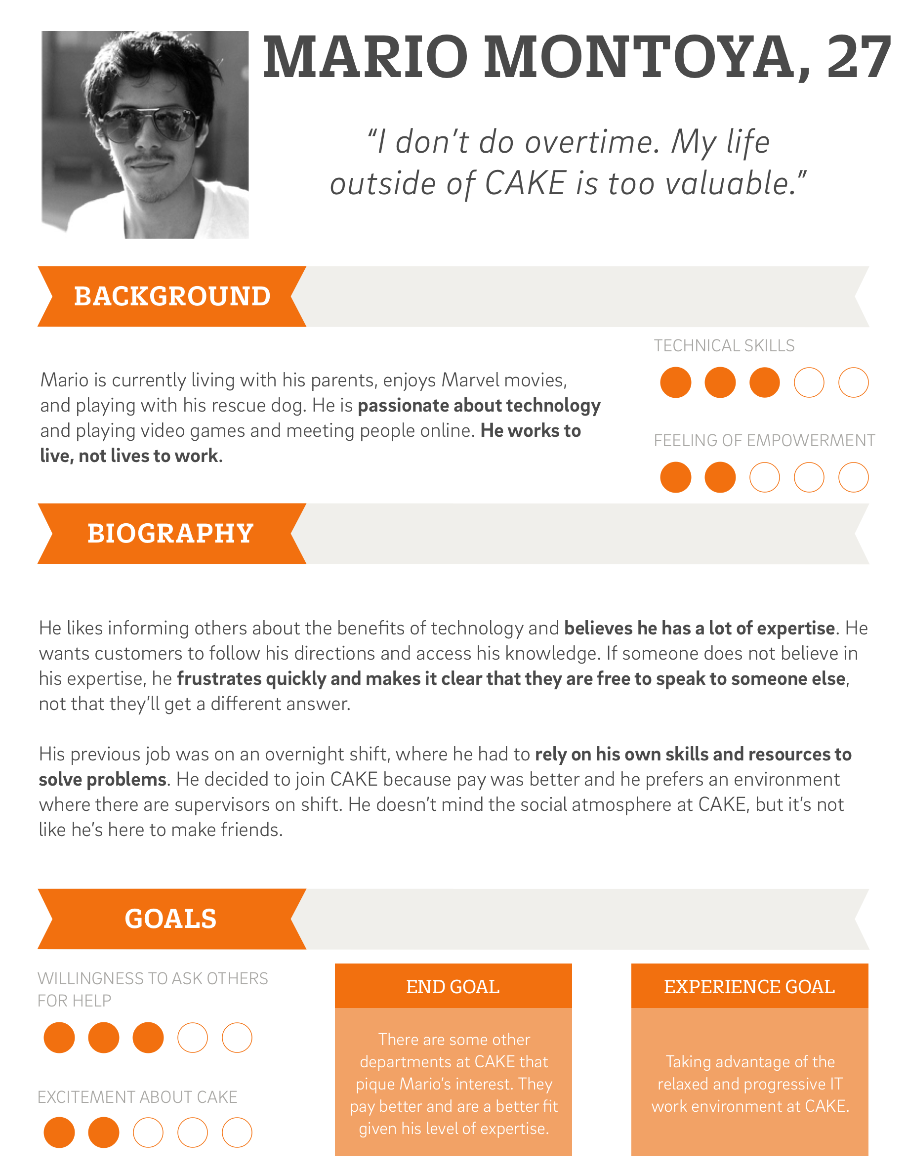
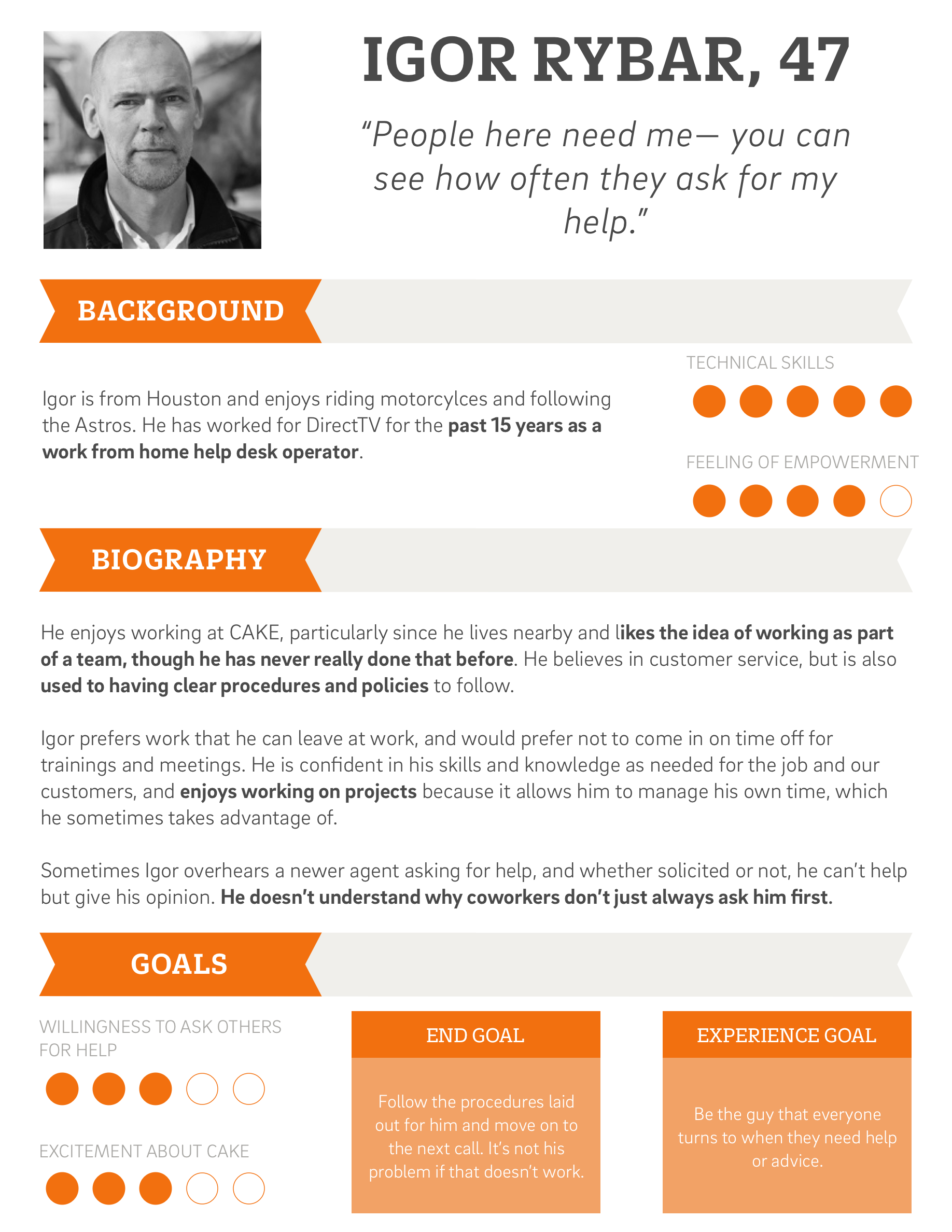
Operations Team Personas
After conducting my initial research I convened a team of five operations managers and directors to talk about the observed goals, motivations, skills and behaviors of the individuals within the operations team. Not only did we want to look at all five of the roles that used Pulse, we also wanted to make sure the application would be useful for each persona that used it.
We started by creating spectrums of attributes upon which we placed the people we had interviewed and observed. Any important discernible difference could be graphed, from technical knowledge to engagement to willingness to ask others for help.

The resultant clusters of interviewees became the blueprints for the personas we created.
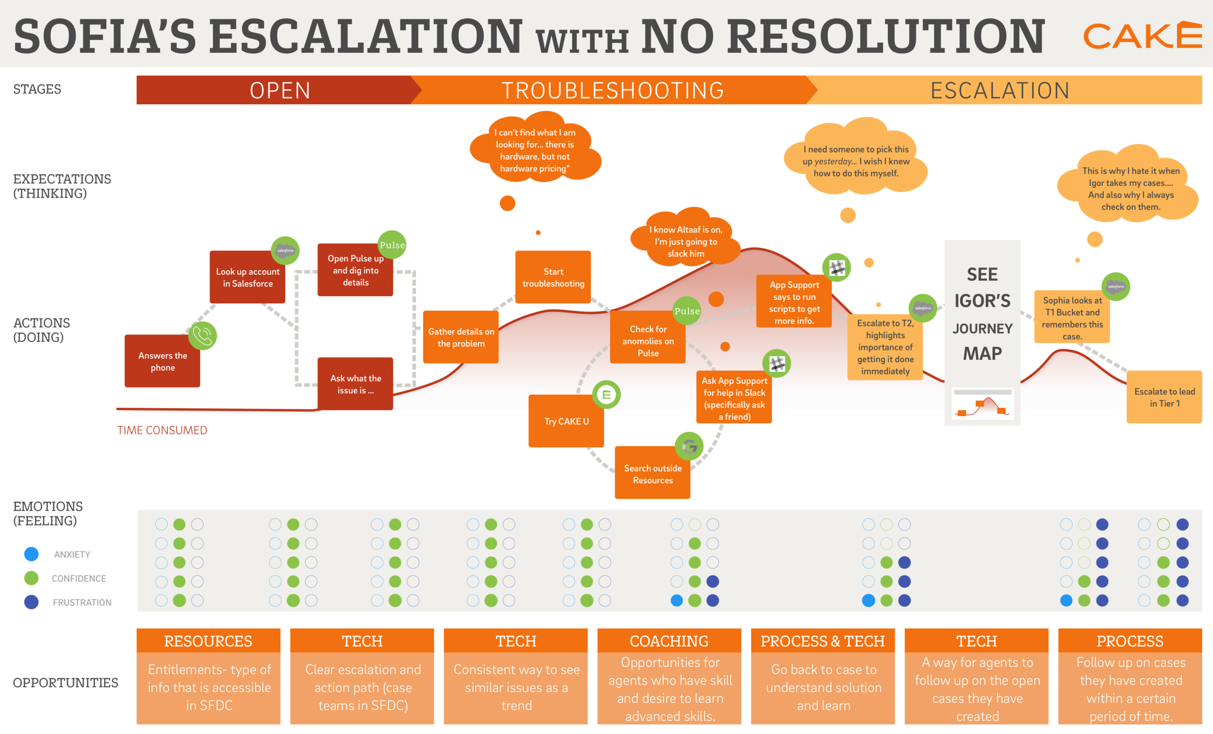
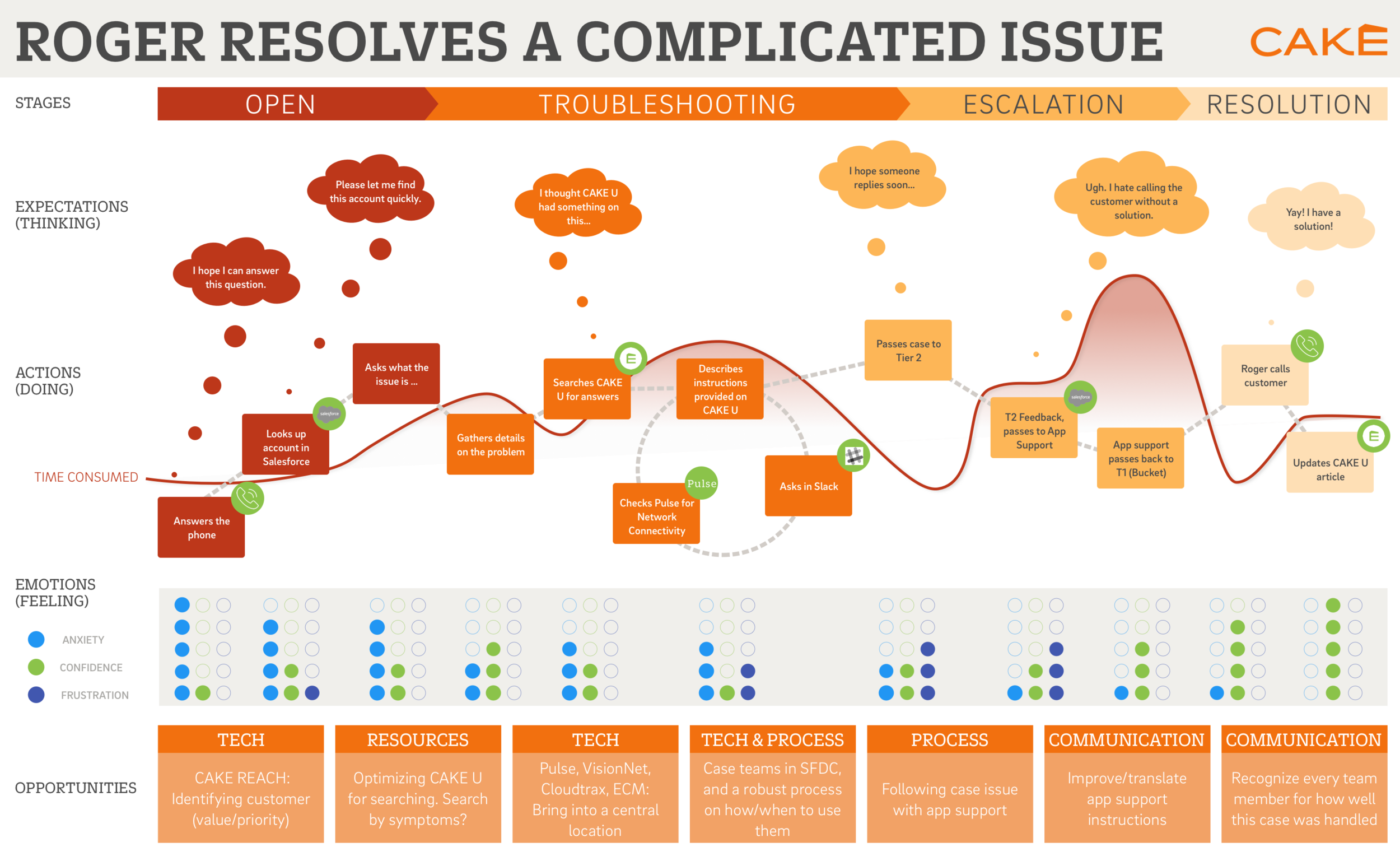
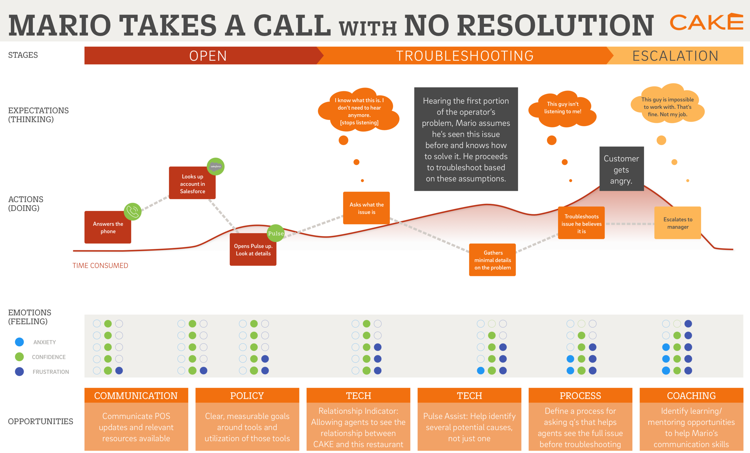
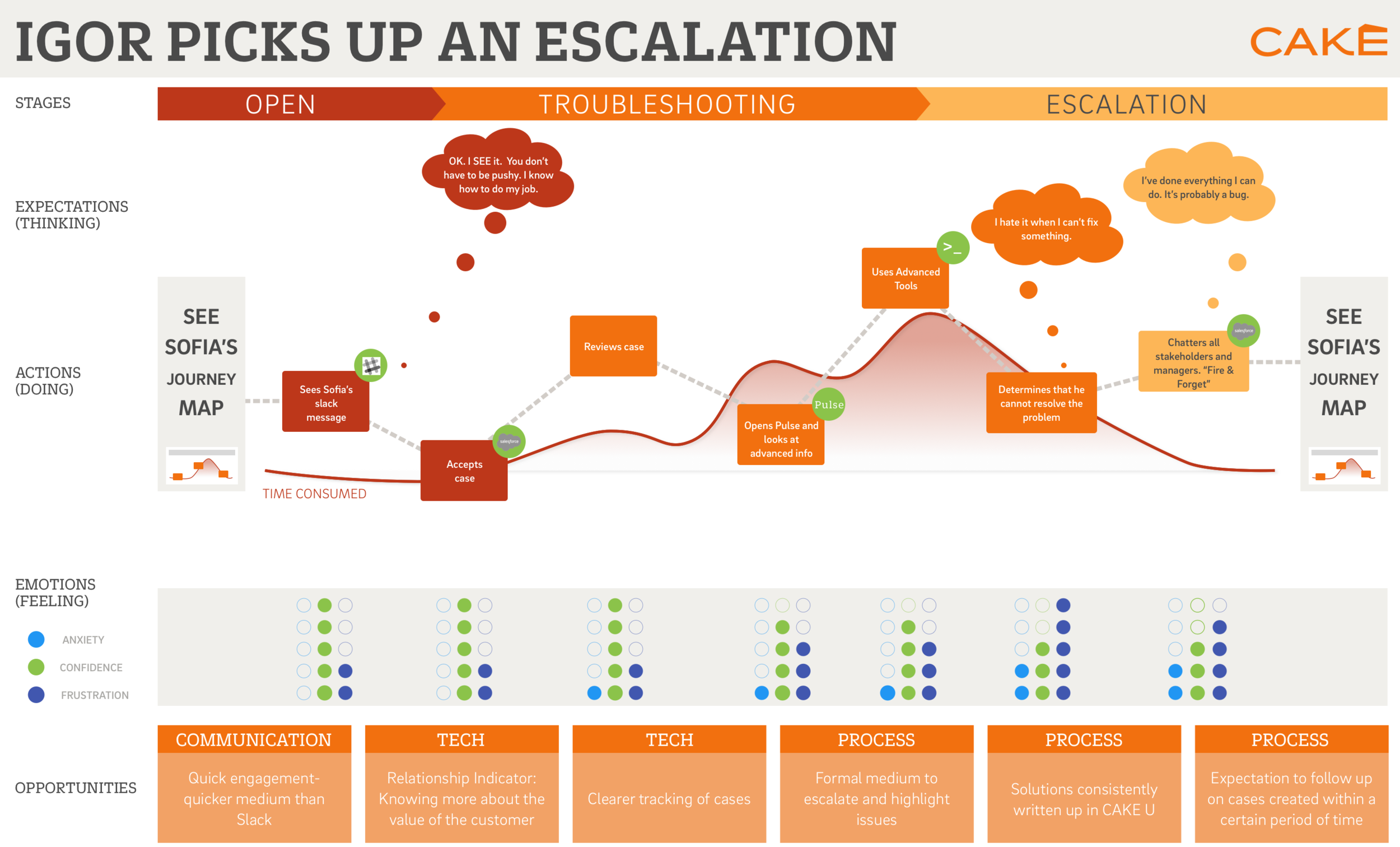
Operations Team Journey Maps
We then used these personas as “characters” in common scenarios that came up frequently in the operations world, such as receiving a difficult call, taking on an escalated issue, and passing on issues to one another.

Design Principles
Expand and Highlight Data that is Out of the Norm
In order to draw the users’ eye towards system readings that indicate a potential problem, we attempted to expand any charts or tables that show problematic information, and minimize any information that shows good or acceptable readings.
In this example, all readings are good, so the tables remain closed when the page loads
In this example, the poor readings on packet loss mean the page opens with this table expanded
Teach Users Where to Look
Our biggest finding was that, while most users knew some of the places to look in order to solve a problem, few knew all of the fields they should be checking. This gave us the opportunity to help educate our users.
To do this, we created Pulse Assist. Turning on Pulse Assist allows the user to look for a commonly asked question/issue such as “Why is my point of sale so slow?” Once a specific question is selected, Pulse Assist highlights ALL of the areas where a user should look to find the factors that could contribute to that problem.

Looking for a commonly asked question on Pulse Assist

Narrowing the topic to a specific question

Pulse Assist then walks the user through EVERY field that they should check. Importantly, it does not just point out the fields where readings are poor, but also highlights areas that happen to be fine in this instance, but should be checked when trying to solve this type of problem in the future.

Once the user has finished searching the relevant fields, she can then use Pulse Assist to directly contact App Support to escalate the problem. Some preliminary text is auto-generated, though users should add more detail as they see fit.
Fast Access for Recent Accounts
Lastly, we found users returning often to the same handful of accounts as they worked to resolve more complex problems. In order to help with this, the Pulse homepage would now feature the most recent accounts, along with icons indicating any new potential issues those accounts might be experiencing.

Landing page that provides most recent restaurant searches, as well as any ongoing issues they are having.
End result
The final result of the Pulse redesign was a tool that had become more easy to search, diagnose issues, and, most importantly, held the capability to help teach users to use all parts of the system in order to better do their jobs. We consistently heard from both users and management that they had expected Pulse Assist to be a tool that new employees would gravitate towards, but once it was in place even the veterans on the support staff found it to be useful. Because it provided a quick way to be able to escalate issues up the chain, veteran users were willing to try it. Once they tried it they found the tool to actually help them be more effective in their roles.

Pulse operator overview page